Tips
Solutions Ink brings you effective and reliable printing services for any of your design concepts. We’re here to help you make the best decisions using our experience in dealing with print companies. On this page you will find information that will almost certainly prove to be of value to your business. These useful tips will help to ensure your print projects run smoothly and on time.
FAQ
What's the difference between "spot colors" and "four color process?
Spot colors are not blends of colors that create other colors but individual colors that can be assigned PMS (Pantone Matching System) numbers.
How well will a pre-press proof match what I see on my monitor?
Due to the wide differences in monitor calibration and the different technologies used, some printed colors in your proof may not exactly match the colors on your monitor. Make sure to always ask the printer if they have any suggestions on color matching.
What's the difference between Bitmap and Vector artwork?
Vector images/artwork (*.eps, *.cdr, *.ai, etc) are made up of many individual, scalable objects. These objects are defined by mathematical calculations rather that pixels, so they always render the highest quality, and are resolution independent. Bitmap images (*.jpg, *.tiff, *.gif, *.bmp, etc.) are best suited for the internet. Think of a Bitmap file as a photograph of an image rather than the image itself, it can't be edited or re-sized easily, and is generally of little value to printers.
What is dpi?
Dots per Inch (of a bitmap image. It does not apply to vector graphics). The measurement of resolution for page printers, photo type setting machines and graphics screens. Graphics screens usually reproduce 60 to 72 dpi, most page printers 300 dpi, and typesetting systems 1,000 dpi.
What is the Pantone Matching System?
Pantone colors are mixed ink colors, identified by a number. This number when used with their "Formula Guide" specifies a mix of certain component ink colors that the printer mixes to put on the press, like mixing paint. PMS match books are books of color where each PMS color has its own name or number that helps you make sure that your colors are the same each time you print, even if your monitor displays a different color or if you change printing services.
How do I choose the right color?
Colors evoke emotions. They inherit connotations. Each one has a language all its own. And the application of color (or the lack thereof) may be a designer’s most effective weapon. Colors rarely signal a universal message. In fact, some colors convey opposing meanings across geographical borders and even within a culture. Color can be used to create attention... or be applied more subtly to avoid it. To get the best results, choose your colors wisely.
- Older adults favor blues and greens. Red is the favorite of children. Yellow is the first color newborns distinguish. It is also the most disturbing color to view for extended periods of time. Green is the most pleasing color to the eye.
- Black type on a white background is the most readable color combination used for printed materials. Red type on a blue background is the least legible.
- Blue is a worldwide favorite among adults, spanning different cultures and customs.
- Designers use color to suggest product attributes like cleanliness, flavor and freshness, as well as corporate attributes like strength, success, speed and quality
Does white count as a printing color?
This will vary depending on the item being imprinted. As a general rule, white will not count as a color, but instead wherever white is in the artwork it is interpreted as transparent, and the actual color of the product will show through. For example, if you have a red and white logo being printed onto a stainless steel mug, the white parts of the artwork will be the stainless steel background, with only the red ink being printed. However, if you were to specify that the white itself must be printed, then it does count as an additional color.
Understanding Print Terminology
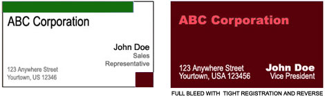
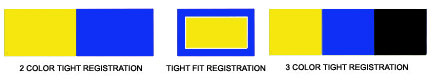
Tight Registration – Results when two colors touch each other on a printed piece. For tight registration include an extra charge.
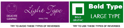
Reverses – Reverses are when you “knock out” a graphic within a solid coverage of ink.
Bleeds – Bleeds are when an image extends to the edge of the printed piece. Bleeds will be an extra charge